

Please see the comments here for an update, 31 March 2020.
If a thousand people read a book, they read a thousand different books. But if a thousand people read an equation, they read the same equation.”
― Lost in Math: How Beauty Leads Physics Astray
Since 21 March I’ve been tracking data of the incidence of covid-19 and the death rate for the US, Pennsylvania (my state), Montgomery County (a Philly suburb, very hard hit), and my home county, Montour (semi-rural but home for Geisinger Medical Center) and South Korea (control, semi-recovered). The data has been taken at 8 am every morning from the World Map and from the Pennsylvania Department of Health web page, updated at 12 noon. It’s important that data sources be uniformly represented if one is to get any meaning from them.
Here’s what I am trying to do:
- to look at the day-by-day difference, that’s Δ(something); here “Δ” means change, change in the value for “something” from the day before;
- to look at the 2nd difference, the difference of this day-by-day difference, that’s Δ(Δ(something))
Here’s what these numbers should tell us: the difference tells us how fast the “something” is increasing, that is the slope of the curve—the larger the Δ(something) the greater the rate at which”something” is increasing; the 2nd difference tells us how fast this rate is increasing.**
HERE’S THE IMPORTANT POINT: when the second difference starts to decrease it means the rate of change is not increasing as fast as before; when the second difference goes from positive to negative it means that a maximum in the rate has been reached and the rate has started to decrease. I’ll insert the featured image here to see what these numbers tells us.
In this spreadsheet, the first column gives the category for row; the other columns are data for the given date. For example the number of US confirmed cases at 27 March is 85996; the difference between US deaths 27 Mar – 26 March is 254.
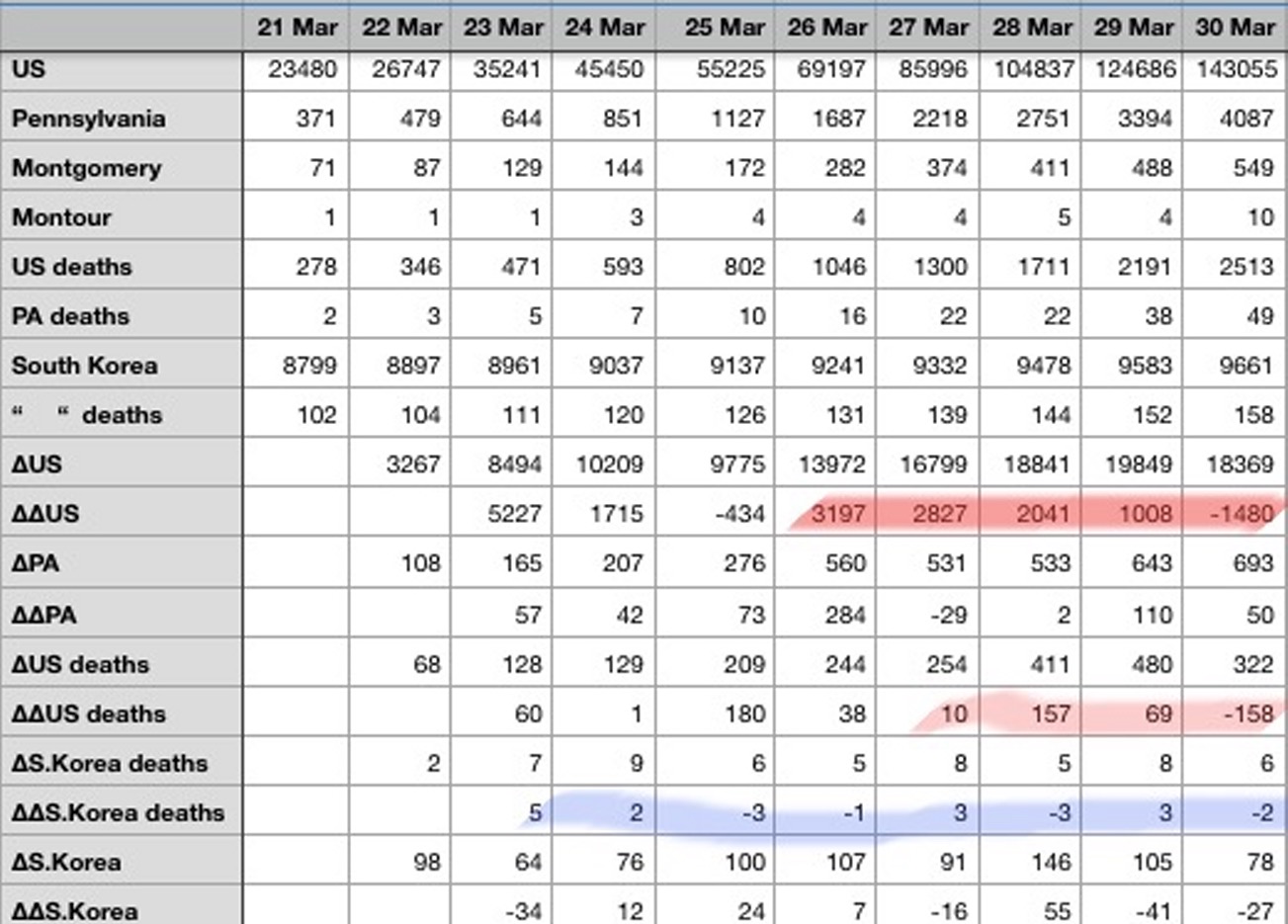
The rows highlighted in red show the second differences, day by day, for the US incidence (number of confirmed cases) and US deaths from March 26th. The 2nd differences for this incidence appear to be decreasing steadily and have even become negative, suggesting that the rate of incidence has started to slow down and perhaps reached a maximum. Perhaps Dr. Fauci’s inflection point has appeared. There appears to be much more random fluctuations in the second differences for US deaths and the S. Korea incidence and deaths, probably because the numbers are smaller. I haven’t done an analysis of variance on these 2nd differences…I’m not sure what the results would signify.
At any rate I’m praying that this trend is for real and that the curve is beginning to flatten.
NOTE
*A daughter told me 10 years ago that I was an Asperger’s Syndrome case. Citing my inability to deal with people, my focus on numbers and equations, and general incapacity for the “real” world, she blamed me for the fact that her four year old son, my sixth grandson, was showing the same symptoms, only more extreme. He could read at 2 (I couldn’t), do simple arithmetic by 3 (I couldn’t) and was greeting people with the salutation, “Hi, what’s your number?”(I didn’t). Wherever I am on the spectrum, I do believe that the road to reality is paved with numbers, so here’s my attempt to fathom what’s going on with covid-19 in this country.
**Those with some calculus background might recall that Δ(something)/Δtime approximates the first derivative of something with respect to time (here Δt is one day), or speed. Δ(Δ(something))/Δtime approximates the second derivative or acceleration or curvature.


I last took calculus in 1978, so forgive me. Are you talking about first and second derivatives of the curves?
Yes Tom, see the note. **
I will take your word for it Bob. I have always found numbers to be stubborn things, unswayable by eloquence and other lawyer tricks.
Don, you and my wife share a point of view about math, except she not only distrusts it, but is afraid of it.
amend that “afraid of it” to “despises it” (she may read the comment).
We take it from that, Bob, that your wife fears nothing 😉
Easiest to remember as:
Velocity, first derivative.
Acceleration, change in velocity, second derivative.
Change in acceleration, third derivative.. and so on..
I went to school to be an engineer, now i is one. Thank God for spell check.
The data has been taken at 8 am every morning from the World Map and from the Pennsylvania Department of Health web page, updated at 12 noon. It’s important that data sources be uniformly represented if one is to get any meaning from them.
<3 <3 <3
Yes, doing the job the media won’t do….
My sympathies to your daughter; I take after my grandmother (also probably would’ve been on the spectrum) and was just lucky to get out of school before they’d pin it on me; my husband is similar, so I know how she feels! The Baron (eldest boy) is definitely giving me a run for my money.
Deletes about a hundred mommy questions like “does he do that funny walk-and-dance-around-on-tiptoe thing, too?”
I’m still in the need-more-data phase, but about ready to throttle various extended family members who think nothing of sending kids to school with the flu but are all-in for forced measures that fit their pragmatism. Heaven forbid that folks be allowed to make their own, reasonably informed choices and that basic measures be taken inside of normal ranges of authority.
David WS-
Thank you, that does make it easier to visualize.
Thanks for the comment, David WS…that’s what I said in the note **
Clearly your grandson has been exposed to Joey Heatherton:
https://www.youtube.com/watch?v=0p6swrw-4Ew
Iran appears to have hit a plateau in recent days, quite possibly Italy as well.
Bob, yes I got that. Just a visual aid. Dave
Great stuff Bob,
You’d think the media could show a simplified version of this each day instead of just case total and death total.
Pessimistic update or fluctuation or ??? See comments on Death Toll 31 March.
Another method of presentation would be to graph the data (EXCEL), and include the 1st & 2nd derivatives (rate & acceleration), and then see what trends are developing.
Filtering the data with say a 1 week running mean on the raw data would also get rid of some of the noise bumps.
J.Bob, thanks for the suggestions. But as Dr. McCoy would say to Captain Kirk, “I’m a physicist, Kirk, not a statistician!” …In any case, I don’t think there’s enough data yet, and it’s too ragged to warrant any serious time series analysis. I thought of doing a polynomial regression, but again…not enough clean data points.
And in fact, there’s a big blip today–see the comments on March 31 Death Toll.