
“A single death is a tragedy; a million deaths is a statistic.”
―
INTRODUCTION
Back again to play the numbers game. I’ve been reading predictions, “models” (as with global warming) predicting 500,000 or more deaths due to covid-19. This is frightening! But how can we evaluate what’s going on, given that most of us (including me) distrust the statistics given out by various “authorities?” Well, I think it’s useful to look at mortality figures from a recent year (say 2017), normalize those numbers to the present date (May 5th) and compare with covid-19 death counts so far. Next, I think we might look at other statistics and see whether indicators might suggest that the incidence rate is decreasing, the fatality rate is not increasing, and the recovery rate is increasing.
A SIMPLE-MINDED NUMBERS GAME
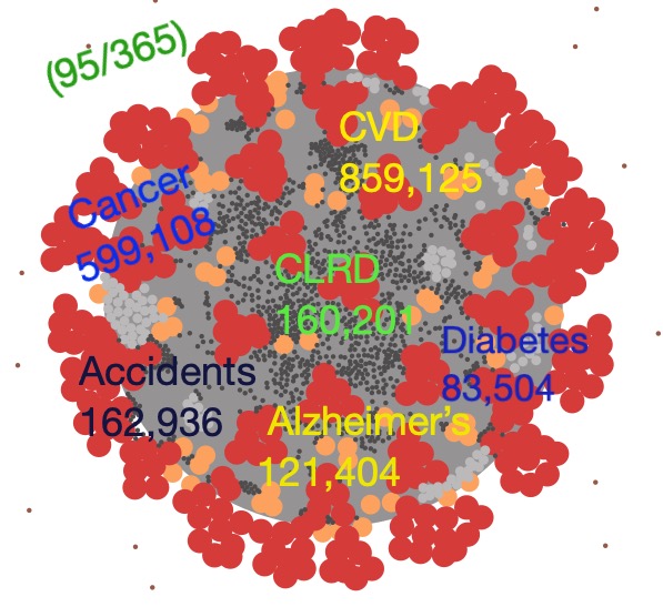
Here’s the game: I’ve taken mortality figures from a 2020 report by the American Heart Association for the year 2017. The numbers for various causes of death are given in the featured image and repeated here; to normalize these number to give deaths up to May 5th, I’ve simply multiplied by 125/365 (the number of days to May 5/ number of days in the year). The numbers are shown in the image below, rounded off to the nearest 1000. The death toll in the US attributed to covid-19 is 71 k, as of May 5 (again, rounded off to the nearest 1000).
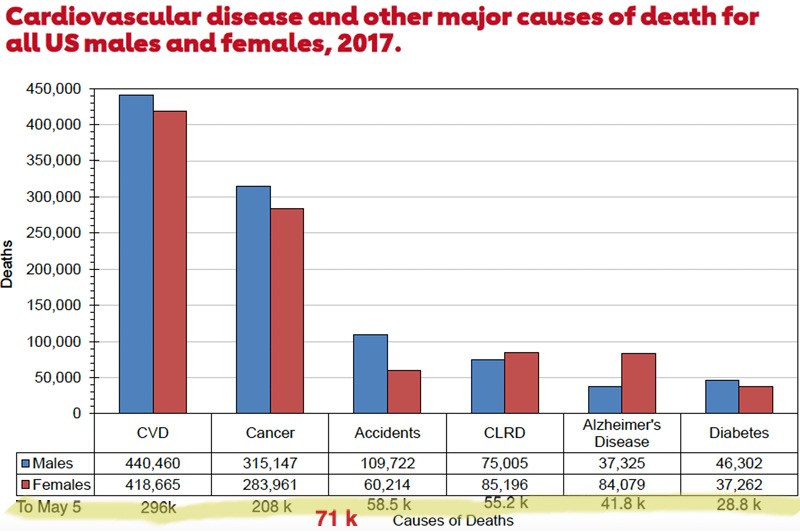
From the American Heart Association
To get the numbers for “To May 5” I’ve assumed a uniform (flat) distribution for 2017–in other words, we’re just taking a piece of the pie proportional to the number of days up to May 5. That’s not too bad an assumption, but there’s also an implicit assumption in this comparison that the distribution of covid-19 deaths is more or less uniform through a year. That’s extremely unlikely.
The graphs that are given below show, I believe that the mortality rate for covid-19 is decreasing. So that number, 71k, is probably larger than it would be if the shape of the mortality curve were taken into account. In any case, we see that even with this overestimate in the comparison, both cancer and cvd (cardiovascular disease) mortalities surpass those due to covid-19, although the covid-19 number is bigger than those for accidents, CLRD (Chronic Lower Respiratory Disease), Alzheimer’s Disease and Diabetes.
SIGNS OF HOPE?
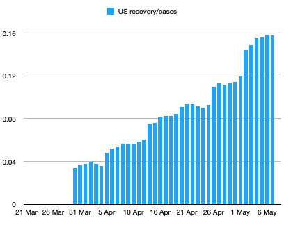
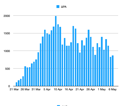
Do the numbers show any signs that things are getting better? One statistic that is most likely to reflect reality is the recovery rate. There should be no ambiguity in defining recovery from being sick with covid-19, so there’s no likely way the numbers could be inflated (or deflated). The number is of course, underestimated since asymptomatic cases or cases with mild symptoms haven’t been reported. But it’s certainly ok to show trends and as a baseline. Here are two graphs showing the progression of recovered cases and the ratio, recovered/cases.
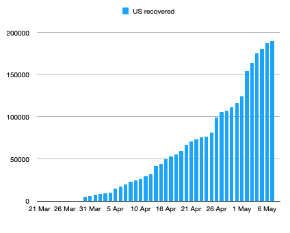
Data from Johns Hopkins World Map
Note that there is a weekly periodicity to both graphs but a steady increase in both. In particular, the ratio of recovered to deaths is increasing from about 1.5 to a little less than 3. (That statistic for S. Korea is about 36 and has varied for European countries from less than 1—UK—to over 10—Germany.) As stated above, the absolute values of the numbers are likely to be low, possibly by an order of magnitude or more, given the likely large number of unreported covid-19 infections.
Here’s one more encouraging sign. The daily case numbers for Pennsylvania (as given by the Pennsylvania Department of Health) are showing a steady decrease,
Data from PA Dept. of Health
as shown in the graph below. Again a weekly periodicity is evident.
FINAL THOUGHTS
These statistics are by no means conclusive but they do suggest that covid-19 is not going to be a repetition of “The Spanish Flu” and, while more serious than the flu, will not rank as a leading cause of death this year. By the way, there’s a fine article by Victor Davis Hanson on the tension between common sense and academic expertise, as it has played out historically and now.


Thanks, Dr. K. Very enlightening and a much needed boost to optimism.
Thanks Bob,
“Covid-19 is not going to be a repetition of The Spanish Flu”
My guess is that we are doing more mitigation today then back in 1918. And modern medicine surly plays a big role in saving many lives that would have been lost 100 years ago.
Ben, i agree that “modern medicine surly plays a big role in saving many lives that would have been lost 100 years ago.” . But with all respect, that is irrelevant to the point I was trying to make. At this stage of the game “modern medicine” has had less impact on “covid-19” than it has had on CHD, Cancer, Accidents, CLHD, Alzheimer’s, and Diabetes. So a comparison of mortality with these causes is certainly relevant to the point that covid-19 is less threatening than some (many?) “experts” would suggest.
Ben, one more comment. From what my wife tells me about her relatives’ tales of what happened with the Spanish Flu in Pittsburgh, I’m not sure mitigation efforts then were less or more effective than the mitigation in NYC at present times. But that, of course, is a purely anecdotal offering.
and thanks for the comment, Ben.
My guess is that we are doing more mitigation today then back in 1918.
Funny thing, thanks to one of those “suddenly popping up all over the place” things, I found out that pretty much all of the steps we’re using were used in San Francisco for the 1918-19 flu. Closing social areas, social distancing, masking, social pressure, even the whole “start out saying it’s nothing and then flip to defcon one” thing.
Including mask mandates, and folks objecting,. They even tried to declare that ending the mask requirement resulted in the surge of infections (when the masks were known to be ineffective), even though before the mask order ended, they had a big parade with 30,000 people to celebrate the end of WWI.
At the end of it? SanFran had one of the worse outcomes. Although their mayor declared, of course, that they’d fared better than average. Even back then, folks figured out they’d been hit very bad.